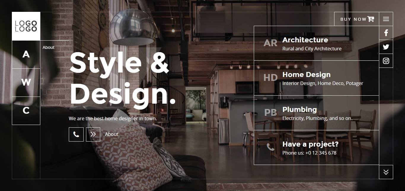
Home screen section - section
This section layout represents the home screen of the index.html file.
CODE
Here is the HTML code to obtain it. Embed it within the main tag with class page-main. Replace texts and buttons by yours.
Please, note that you can not use the data-section value twice for a different section within an HTML page, as it will be the id
of the section later.
HTML Section - Home
<!-- Begin of home section -->
<div class="section section-home fullscreen-md fp-auto-height-responsive main-home border-sm section-centered" data-section="home">
<!-- Begin of section wrapper -->
<div class="section-wrapper fullwidth with-margin v-center">
<!-- content -->
<div class="section-content anim">
<div class="row">
<div class="col-12 col-lg-12 text-left">
<!-- title -->
<div class="title-desc">
<h1 class="display-4 display-title display-decor home-title text-slide-in anim-1-off">Style &
<br>Design.</h1>
</div>
</div>
<div class="col-12 col-lg-8 text-left">
<!-- description -->
<div class="title-desc">
<p class="anim-4">We are the best home designer in town.</p>
</div>
<!-- Action button -->
<div class="btns-action anim-5">
<a href="#contact" class="btn btn-social">
<i class="icon fa fa-phone"></i>
</a>
<a class="btn btn-arrow btn-primary" href="#about">
<span class="icon">
<span class="arrow-right"></span>
</span>
<span class="text">About</span>
</a>
</div>
</div>
</div>
</div>
<div class="section-aside small-relative aside-middle">
<ul class="nav nav-btns-list">
<li class="nav-item">
<a class="btn-framed" href="#services/0">
<span class="icon">AR</span>
<span class="text">
<span class="b-title">Architecture</span>
<span class="b-desc">Rural and City Architecture</span>
</span>
</a>
</li>
<li class="nav-item">
<a class="btn-framed" href="#services/1">
<span class="icon">HD</span>
<span class="text">
<span class="b-title">Home Design</span>
<span class="b-desc">Interior Design, Home Deco, Potager</span>
</span>
</a>
</li>
<li class="nav-item">
<a class="btn-framed" href="#services/2">
<span class="icon">PB</span>
<span class="text">
<span class="b-title">Plumbing</span>
<span class="b-desc">Electricity, Plumbing, and so on.</span>
</span>
</a>
</li>
<li class="nav-item">
<a class="btn-framed" href="#contact">
<span class="icon">
<i class="fa fa-phone"></i>
</span>
<span class="text">
<span class="b-title">Have a project?</span>
<span class="b-desc">Phone us: +0 12 345 678</span>
</span>
</a>
</li>
</ul>
</div>
<!-- Arrows scroll down/up -->
<footer class="section-footer scrolldown">
<!--<a class="up">
<span class="btn btn-arrow">
<span class="icon">
<span class="arrow-up"></span>
</span>
</span>
</a>-->
<a class="down">
<span class="btn btn-arrow">
<span class="icon">
<span class="arrow-down"></span>
</span>
</span>
</a>
</footer>
</div>
<!-- End of section wrapper -->
</div>
<!-- End of home section -->
Div with class aside-middle represents the gramed button list a right. It uses flexbox so its automatically distribute its content along the height of the section.