HTML Structure
Here is the general structure of the HTML pages (index and item.html) :
- The HTML head Tag contains meta data for SEO, CSS include and social networks meta data.
- The header (at top) of a page is nested within a tag with class
page-header. It includes the logo (left), the menu icon (right), the menu contents and the side bar naav. - The navigation menu (Sidebar Menu), located within the
page-headeris nested within a nav tag with a classmain-menu. - The background cover of the page is nested within a div tag with a class
page-cover. -
The main content of the page is nested within a tag with a class
page-main. Inside, each section (slide) is embeded within a div tag with a classsection. It contains one or several section, represented by div with classsection - And the footer of the page, containing basic information such as copyright notice or social networks links. It is located within the footer tag with class
page-footer.
<!doctype html>
<html class="no-js" lang="en">

<head>
  ... head tag
</head>

<body id="menu" class="body-black">

  <!-- BEGIN OF site header Menu -->
  <header class="page-header navbar page-header-alpha scrolled-white menu-right topmenu-right">
    ...

    <!-- begin of menu wrapper -->
    <div class="all-menu-wrapper" id="navbarMenu">

      <!-- Begin of hamburger mainmenu menu -->
      <nav class="navbar-mainmenu">
        ... menu content
      </nav>
      <!-- End of hamburger mainmenu menu -->

      <!-- Begin of sidebar nav menu params class: text-only / icon-only-->
      <nav class="navbar-sidebar ">
        ... sidebar nav content
      </nav>
      <!-- End of sidebar nav menu -->
    </div>
    <!-- end of menu wrapper -->

  </header>
  <!-- END OF site header Menu-->

  <!-- BEGIN OF page cover -->
  <div class="page-cover">
    ...
  </div>
  <!--END OF page cover -->

  <!-- BEGIN OF page main content -->
  <main class="page-main ..." id="...">
    <div class="section ..." data-section="home">
      ... A section
    </div>
    ... Another section
  </main>
  <!-- END OF page main content -->

  <!-- BEGIN OF page footer -->
  <footer id="site-footer" class="page-footer">
    ...
  </footer>
  <!-- END OF site footer -->

  <!-- scripts -->
  <!-- All Javascript plugins goes here -->
  ...
</body>

</html>
Title and description for SEO - top
The <head> tag contains the Title and description of the tag, used
by search engine to identify your website. It may also include, third-party meta,
such as social network meta (mainly Facebook and Twitter) helping them to describe your website.
Change the title and the description of your page by editing the title tag value, and the content value of the tag <meta name="description" content="YOUR DESCRIPTION">.
Additionaly, you can add Facebook Opengraph data or Twitter metadata for better compatibility with these social networks.
Required CSS are also included within the <head> tag with <link rel="stylesheet" href="...">.
Here is the structure of the <head> tag :
<!doctype html>
<!--
Website By Miradontsoa / MiVFX
http://twitter.com/miradontsoa
http://miradontsoa.com
-->

<html class="no-js" lang="en">

<head>
  <meta http-equiv="content-type" content="text/html; charset=UTF-8">

  <!-- Page Title Here -->
  <title>Brainux - A portfolio / onepage template</title>

  <!-- Meta -->
  <!-- Page Description Here -->
  <meta name="description" content="A beautiful and creative portfolio template. It is mobile friend (responsive) and comes with smooth animations">

  <!-- Disable screen scaling-->
  <meta name="viewport" content="width=device-width, user-scalable=no, initial-scale=1, maximum-scale=1, user-scalable=0">

  <!-- Twitter Meta -->
  <meta name="twitter:site" content="@miradontsoa">
  <meta name="twitter:creator" content="@miradontsoa">
  <meta name="twitter:card" content="summary">
  <meta name="twitter:title" content="Page Title">
  <meta name="twitter:description" content="Description of the page">
  <meta name="twitter:image" content="/img/bg-default.jpg">

  <!-- Facebook Meta -->
  <meta property="og:url" content="your website url here">
  <meta property="og:title" content="Page Title">
  <meta property="og:description" content="Description of the page">
  <meta property="og:type" content="website">
  <meta property="og:image" content="/img/bg-default.jpg">
  <meta property="og:image:secure_url" content="/img/bg-default.jpg">
  <meta property="og:image:type" content="image/jpg">
  <meta property="og:image:width" content="1200">
  <meta property="og:image:height" content="630">

  <!-- Place favicon.ico and apple-touch-icon(s) in the root directory -->
  <!-- Web fonts and Web Icons -->
  <link rel="stylesheet" href="./fonts/opensans/stylesheet.css">
  <link rel="stylesheet" href="./fonts/montserrat/stylesheet.css">
  <link rel="stylesheet" href="./fonts/bebas/stylesheet.css">
  <link rel="stylesheet" href="./fonts/ionicons.min.css">
  <link rel="stylesheet" href="./fonts/font-awesome.min.css">

  <!-- Vendor CSS style -->
  <link rel="stylesheet" href="./css/pageloader.css">

  <!-- Uncomment below to load individualy vendor CSS -->
  <link rel="stylesheet" href="./css/bootstrap.min.css">
  <link rel="stylesheet" href="./js/vendor/swiper.min.css">
  <link rel="stylesheet" href="./js/vendor/jquery.fullpage.min.css">
  <link rel="stylesheet" href="./js/vegas/vegas.min.css">

  <!-- Main CSS files -->
  <link rel="stylesheet" href="./css/main.css">

  <!-- add alt layout here -->
  <link rel="stylesheet" href="./css/style-default.css">

  <script src="./js/vendor/modernizr-2.7.1.min.js"></script>
</head>
Page Header - top
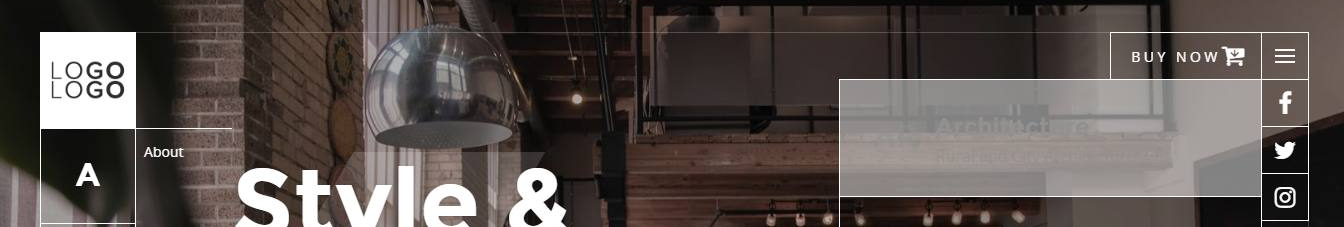
The header , positioned at the top of the screen, are located within the div with a
header-top class.
It contains the menu icon (the
button tag with class
site-menu-icon), the logo (within the a tag with
nav-brand class), the main menu (within a nav with class
navbar-mainmenu) and the sidebar menu (The nav with class
navbar-sidebar).
Here is the structure of the
<header class="page-header ..."> tag :
<!-- BEGIN OF site header Menu -->
<header class="page-header navbar page-header-alpha scrolled-white">

    <!-- Begin of menu icon toggler -->
    <button class="navbar-toggler site-menu-icon" id="navMenuIcon">
        <!-- Available class : menu-icon-dot / menu-icon-thick /menu-icon-random -->
        <span class="menu-icon menu-icon-normal">
            <span class="bars">
                <span class="bar1"></span>
                <span class="bar2"></span>
                <span class="bar3"></span>
            </span>
        </span>
    </button>
    <!-- End of menu icon toggler -->

    <!-- Begin of logo/brand -->
    <a class="navbar-brand" href="./#">
        <span class="logo">
            <img class="light-logo" src="img/logo.png" alt="Logo">
        </span>
        <!-- logo title (optional) -->
        <!-- <span class="text">
            <span class="line">Brainux</span>
            <span class="line sub">Portfolio Template</span>
        </span> -->
    </a>
    <!-- End of logo/brand -->

    <!-- begin of menu wrapper -->
    <div class="all-menu-wrapper" id="navbarMenu">
        <!-- Begin of top menu -->
        <nav class="navbar-topmenu">
            <ul class="navbar-social">
                <li class="nav-item">
                    <a href="//facebook.com/miradontsoa" class="btn-social">
                        <i class="icon fa fa-facebook"></i>
                    </a>
                </li>
                <li class="nav-item">
                    <a href="//twitter/miradontsoa" class="btn-social">
                        <i class="icon fa fa-twitter"></i>
                    </a>
                </li>
                <li class="nav-item">
                    <a href="//instagram.com/miradontsoa" class="btn-social">
                        <i class="icon fa fa-instagram"></i>
                    </a>
                </li>
            </ul>
            <!-- Begin of CTA Actions, & Icons menu (optional) -->
            <ul class="navbar-nav navbar-nav-actions">
                <li class="nav-item">
                    <a class="btn btn-outline btn-round" target="_blank" href="https://themeforest.net/user/mivfx/portfolio">
                        <span class="text">Buy Now</span>
                        <span class="icon big">
                            <span class="fa fa-cart-arrow-down"></span>
                        </span>
                    </a>
                </li>
            </ul>
            <!-- End of CTA & Icons menu -->
        </nav>
        <!-- End of top menu -->

        <!-- Begin of hamburger mainmenu menu -->
        <nav class="navbar-mainmenu">
            <div class="click-exit"></div>
            <ul class="navbar-nav mr-auto">
                <li class="nav-item active">
                    <a class="nav-link" href="./index.html#home">About
                        <span class="sr-only">(current)</span>
                    </a>
                </li>
                <li class="nav-item">
                    <a class="nav-link" href="./gallery.html">Projects</a>
                </li>
                <li class="nav-item">
                    <a class="nav-link" href="./item.html">Item</a>
                </li>
                <li class="nav-item">
                    <a class="nav-link" href="./index.html#home">Contact</a>
                </li>
                <li class="nav-item">
                    <a class="nav-link" href="./demo.html">Demo</a>
                </li>
            </ul>
            <div class="menu-social">
                <p class="note">Website made with love by
                    <a href="//highhay.com">
                        <span class="marked">Miradontsoa</span>
                    </a>
                </p>
                <ul class="social">
                    <li>
                        <a href="//facebook.com/miradontsoa">
                            <i class="icon fa fa-facebook"></i>
                        </a>
                    </li>
                    <li>
                        <a href="//twitter/miradontsoa">
                            <i class="icon fa fa-twitter"></i>
                        </a>
                    </li>
                    <li>
                        <a href="//instagram.com/miradontsoa">
                            <i class="icon fa fa-instagram"></i>
                        </a>
                    </li>
                </ul>
            </div>
        </nav>
        <!-- End of hamburger mainmenu menu -->

        <!-- Begin of sidebar nav menu params class: text-only / icon-only-->
        <nav class="navbar-sidebar font-primary">
            <ul class="navbar-nav" id="qmenu">
                <li class="nav-item" data-menuanchor="home">
                    <a href="#home">
                        <span class="icon">A</span>
                        <span class="txt">About</span>
                    </a>
                </li>
                <li class="nav-item" data-menuanchor="projects">
                    <a href="#projects">
                        <span class="icon">W</span>
                        <span class="txt">Works</span>
                    </a>
                </li>
                <li class="nav-item" data-menuanchor="contact">
                    <a href="#contact">
                        <span class="icon">C</span>
                        <span class="txt">Contact</span>
                    </a>
                </li>
            </ul>
        </nav>
        <!-- End of sidebar nav menu -->
    </div>
    <!-- end of menu wrapper -->

</header>
<!-- END OF site header Menu-->
Replace your
img/logo.png by your logo URL or go to img folder and replace logo.png sample image with yours.
The
button tag with class
site-menu-icon displays the menu icon. Within it, there is a span tag with class
menu-icon.
The main menu content is located within a nav with class navbar-mainmenu located under the all-menu-wrapper div.
Duplicate the li content to add more navigation items and links
<!-- Begin of hamburger mainmenu menu -->
<nav class="navbar-mainmenu">
    <div class="click-exit"></div>
    <ul class="navbar-nav mr-auto">
        <li class="nav-item active">
            <a class="nav-link" href="./index.html#home">About
                <span class="sr-only">(current)</span>
            </a>
        </li>
        <li class="nav-item">
            <a class="nav-link" href="./gallery.html">Projects</a>
        </li>
        <li class="nav-item">
            <a class="nav-link" href="./item.html">Item</a>
        </li>
        <li class="nav-item">
            <a class="nav-link" href="./index.html#home">Contact</a>
        </li>
        <li class="nav-item">
            <a class="nav-link" href="./demo.html">Demo</a>
        </li>
    </ul>
    <div class="menu-social">
        <p class="note">Website made with love by
            <a href="//highhay.com">
                <span class="marked">Miradontsoa</span>
            </a>
        </p>
        <ul class="social">
            <li>
                <a href="//facebook.com/miradontsoa">
                    <i class="icon fa fa-facebook"></i>
                </a>
            </li>
            <li>
                <a href="//twitter/miradontsoa">
                    <i class="icon fa fa-twitter"></i>
                </a>
            </li>
            <li>
                <a href="//instagram.com/miradontsoa">
                    <i class="icon fa fa-instagram"></i>
                </a>
            </li>
        </ul>
    </div>
</nav>
<!-- End of hamburger mainmenu menu -->
The nav with class navbar-sidebar represent the sidebar menu positioned at left.
It is explained below :
Sidebar navigation Menu - top
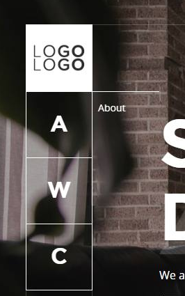
Sidebar Navigation codes are located within the nav tag with a class
navbar-sidebar (which is embedded within the header page-header).
<!-- Begin of sidebar nav menu params class: text-only / icon-only-->
<nav class="navbar-sidebar font-primary">
    <ul class="navbar-nav" id="qmenu">
        <li class="nav-item" data-menuanchor="home">
            <a href="#home">
                <span class="icon">A</span>
                <span class="txt">About</span>
            </a>
        </li>
        <li class="nav-item" data-menuanchor="projects">
            <a href="#projects">
                <span class="icon">W</span>
                <span class="txt">Works</span>
            </a>
        </li>
        <li class="nav-item" data-menuanchor="contact">
            <a href="#contact">
                <span class="icon">C</span>
                <span class="txt">Contact</span>
            </a>
        </li>
    </ul>
</nav>
<!-- End of sidebar nav menu -->
Each menu item is represented by a
li element with the following structure :
<li class="nav-item" data-menuanchor="home">
<a href="#home">
    <span class="icon">A</span>
    <span class="txt">About</span>
</a>
</li>
The tag <span class="txt">Your text</span> represents the text content.
li data-menuanchor= should have the same value as a href=
but without the #. This value will refer to a
section with a data-section of the same value.
You can anyway
use external URL for the link.
Background cover of the page - top
This part represents the fullscreen background image, background video or particles animations of the page. It is located within the tag with a class page-cover
<!-- BEGIN OF page cover -->
<div class="page-cover">
    ...
</div>
<!-- END OF page Cover -->
It can embed layers of ;
Static image background
Edit the data-image-src attribute of the cover-bg div to match to your background image url or source such as :
<div class="cover-bg pos-abs full-size bg-img" data-image-src="img/bg_default.jpg"></div>
Replace bg_default.jpg by yours or with an image url
Mouse Parallax Effects
To obtain mouse parallax effects, add id="parallax-cover" to the div page-cover container, then add attribute data-depth="0.2" to cover-bg element.
Your page cover code will looks like this later:
<!-- BEGIN OF page cover -->
<div class="page-cover" id="parallax-cover">
    <!-- Cover Background -->
    <div data-depth="0.2" class="cover-bg bg-img" data-image-src="img/bg-default.jpg"></div>

    <!-- Transluscent mask as filter -->
    <div class="cover-bg-mask bg-color" data-bgcolor="rgba(2, 3, 10, 0.7)"></div>
</div>
<!--END OF page cover -->
Solid color as filter or background
To add a solid color layer as mask or as background of the page, add the following code within the page-cover div tag, and replace the data-bgcolor with a color value:
<div class="cover-bg pos-abs full-size bg-color" data-bgcolor="rgba(55,55,55,1)" />
Check out index-solidcolor.html for a demo.
Particle as filter or background
To add a particle layer as mask or as background of the page, add the following code within the page-cover div tag:
<div
  id="particles-js"
  class="cover-bg pos-abs full-size bg-color"
  data-bgcolor="rgba(37, 38, 42, 0.81)"
/>
Also, in the script emplacement (at the bottom of the body tag), add the following lines :
<script src="./js/particlejs/particles.min.js"></script>
<script src="./js/particlejs/particles-init.js"></script>
You can edit the data-bgcolor="rgba(37, 38, 42, 0.81) value to change background or filter color.
Check out index-particlebg.html or index-snowbg.html for demo.
Slideshow images background
To add slideshow images as background of the page, add the following code within the page-cover div tag:
<div class="cover-bg pos-abs full-size slide-show">
  <i class="img" data-src="./img/bg-default1.jpg" />
  <i class="img" data-src="./img/bg-default2.jpg" />
  <i class="img" data-src="./img/bg-default3.jpg" />
  <i class="img" data-src="./img/bg-default4.jpg" />
</div>
The <i class='img' data-src='./img/bg-defaultURL.jpg'></i> line represents a picture slide.
Check out index-slideshow.html for a demo.
Video as background
Add the following code within the previous page-cover div tag and edit the source url <source src="..." > to match to your video (replace the flower_loop.mp4 video under the vid folder by another one) :
<div id="container" class="video-container d-none d-md-block">
  <video autoplay="autoplay" loop="loop" autobuffer="autobuffer" muted="muted"
       width="640" height="360">
    <source src="vid/flower_loop.mp4" type="video/mp4">
  </video>
</div>
Check out index-video.html for a demo.
Video background are deactivated on mobile device for performance reason. To activate it, just remove the d-none class.
Youtube, Vimeo Video as background
Add the following code within the previous page-cover div tag and edit the source url <iframe src="..." > to match to your youtube video url (just replace the ID_OF_VIDEO by the youtube video ID) :
<div class="youtube-container video-container">
  <iframe
    frameborder="0"
    src="https://youtube.com/embed/ID_OF_VIDEO?autoplay=1&controls=0&showinfo=0&autohide=1"/>
</div>
For Vimeo or facebook video, replace the iframe by provided Vimeo or Facebook embed code.
Main content of the Page - top
The main content of the page is located within the div with a class page-main
<!-- BEGIN OF site main content content here -->
<main class="page-main  ..." id="...">
    <div class="section ..." ...>
        ... A section
    </div>
    ... Another section
</main>
<!-- END OF site main content content here -->
For the main index.html file or index-XXX.html file, this main tag should have an id="mainpage". Class main-anim will enable animation on page scroll.
For the page item.html, the id of the main tag should be id="itempage".
And For the page gallery.html, this id should be id="gallerypage".
The <main class="page-main ..." id="...">is a combination of multiple components called Section.
A section is represented with a div or section tag with class section.
Check out the section list to see all available sections layout :
Site footer

At bottom of the page (after the main tag), optional div with class site-footer embeds the social links (ul with class social-text), and additional website footer notice (such as copyright).
<!-- BEGIN OF page footer -->
<footer id="site-footer" class="page-footer">

    <!-- Right content -->
    <div class="footer-right">
        <ul class="social-text">
            <li>
                <a href="//facebook.com/miradontsoa">Facebook</a>
            </li>
            <li>
                <a href="//twitter/miradontsoa">Twitter</a>
            </li>
            <li>
                <a href="//instagram.com/miradontsoa">Instagram</a>
            </li>
        </ul>
    </div>
</footer>
<!-- END OF site footer -->