Service section - section
This section layout represents the "service section" of the index.html file. Use it to list your main activities.
CODE
Here is the HTML code to obtain it. Embed it within the main tag with class page-main. Replace texts and buttons by yours.
You can duplicate this section as much as you want. Just note that you can not use the data-section value twice for a different section within an HTML page, as it will be the id
of the section later.
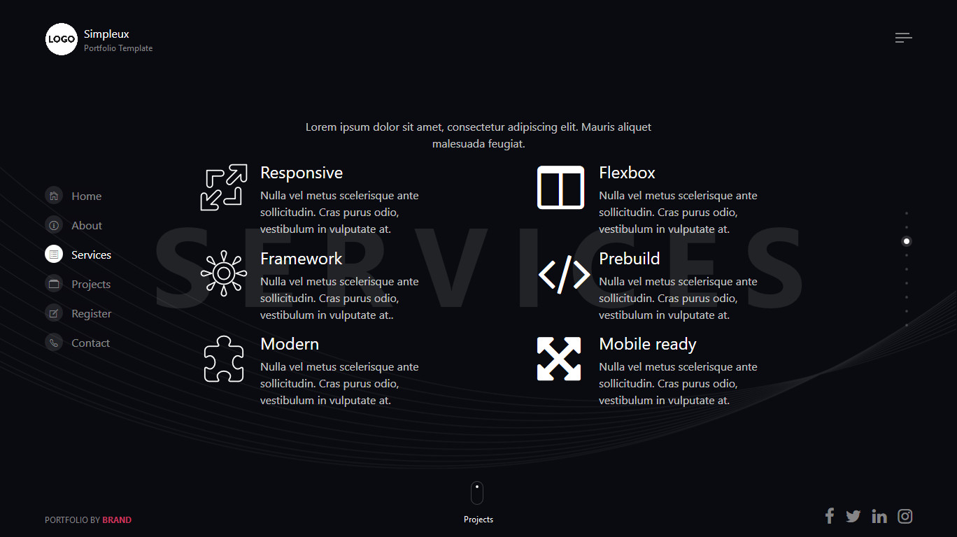
HTML Section - Service
<div class="section section-list-feature fp-auto-height-responsive " data-section="services">
    <!-- Begin of section wrapper -->
    <div class="section-wrapper twoside">
        <!-- title -->
        <div class="section-title text-center">
            <h2 class="display-4 display-title title-bg">Services</h2>
            <p>Lorem ipsum dolor sit amet, consectetur adipiscing elit. Mauris aliquet malesuada feugiat.</p>
        </div>

        <!-- text or illustration order are manipulated via Bootstrap order-md-1, order-md-2 class -->
        <!-- begin of item -->
        <div class="item row justify-content-between">
            <!-- begin of column content -->
            <div class="col-12 col-md-6 col-lg-5">
                <!-- content -->
                <div class="section-content anim">
                    <!-- a media object -->
                    <div class="media">
                        <div class="img d-flex mr-3">
                            <img class="" src="img/icons/icon1.svg" alt="An image">
                        </div>
                        <div class="media-body">
                            <h4>Responsive</h4>
                            <p>Nulla vel metus scelerisque ante sollicitudin. Cras purus odio, vestibulum in vulputate at.</p>
                        </div>
                    </div>
                    <!-- a media object -->
                    <div class="media">
                        <div class="img d-flex mr-3">
                            <img class="" src="img/icons/icon2.svg" alt="An image">
                        </div>
                        <div class="media-body">
                            <h4>Framework</h4>
                            <p>Nulla vel metus scelerisque ante sollicitudin. Cras purus odio, vestibulum in vulputate at..</p>
                        </div>
                    </div>
                    <!-- a media object -->
                    <div class="media">
                        <div class="img d-flex mr-3">
                            <img class="" src="img/icons/icon3.svg" alt="An image">
                        </div>
                        <div class="media-body">
                            <h4>Modern</h4>
                            <p>Nulla vel metus scelerisque ante sollicitudin. Cras purus odio, vestibulum in vulputate at.</p>
                        </div>
                    </div>
                </div>
            </div>
            <!-- end of column content -->

            <!-- begin of column content -->
            <div class="col-12 col-md-6 col-lg-5">
                <!-- content -->
                <div class="section-content anim">
                    <!-- a media object -->
                    <div class="media">
                        <div class="img d-flex mr-3">
                            <i class="icon fa fa-columns"></i>
                        </div>
                        <div class="media-body">
                            <h4>Flexbox</h4>
                            <p>Nulla vel metus scelerisque ante sollicitudin. Cras purus odio, vestibulum in vulputate at.</p>
                        </div>
                    </div>
                    <!-- a media object -->
                    <div class="media">
                        <div class="img d-flex mr-3">
                            <i class="icon fa fa-code"></i>
                        </div>
                        <div class="media-body">
                            <h4>Prebuild</h4>
                            <p>Nulla vel metus scelerisque ante sollicitudin. Cras purus odio, vestibulum in vulputate at.</p>
                        </div>
                    </div>
                    <!-- a media object -->
                    <div class="media">
                        <div class="img d-flex mr-3">
                            <i class="icon fa fa-arrows-alt"></i>
                        </div>
                        <div class="media-body">
                            <h4>Mobile ready</h4>
                            <p>Nulla vel metus scelerisque ante sollicitudin. Cras purus odio, vestibulum in vulputate at.</p>
                        </div>
                    </div>
                </div>
            </div>
            <!-- end of column content -->
        </div>
        <!-- end of item -->

        <!-- Arrows scroll down/up -->
        <footer class="section-footer scrolldown">
            <a class="down">
                <span class="icon"></span>
                <span class="txt">Projects</span>
            </a>
        </footer>
    </div>
    <!-- End of section wrapper -->
</div>